Attractive web design will help “sell” your ideas and improve your website’s effectiveness.
Your website is developed. You’ve got your basic design and it looks good. Yay!
Now you want to add content to your pages. Don’t muck up a pretty design with ugly pages or poor copywriting. Think of every page as an opportunity to impress your potential customer.
Good design goes hand-in-hand with good copy. Keep the following guidelines in mind for best results:
The ideal length for a page of web copy on a regular web site (not a landing page) is 300-600 words. That’s long enough to explain a topic and attract the search engines, but not so lengthy that your reader will feel overwhelmed and click off or resort to only scanning.
Forget cutesy or crafty. Tell the reader what to expect. If possible, include a benefit so he knows why it’s worth his time to read on. Your headline should be 4 to 8 words.
They break up big blocks of text and also help the reader to flow from one paragraph to the next. Like headlines, keep subheads under 8 words long, and those words should be truly reflective of the paragraph’s content.
Reading on a computer screen is more challenging than reading a printed document. It’s easy to lose your place, and big chunks of text are daunting.
Keep paragraphs under five lines, roughly 40-70 words. Yes, that probably goes against what you learned in high school English class. But that’s okay. After all, do you really want your website to read like a term paper? Yawn.
Keep your sentences to under 20 words. Too much information in one sentence hinders comprehension. The reader will have difficulty following your thoughts. Also, vary the length of your sentences to make your copy more interesting. Sometimes a 1- to 4-word sentence is the perfect way to make an important point.
Good copywriting makes a difference. It can compel the reader to take action and help build your brand. Consider hiring a professional copywriter to do it right. Your investment in quality copy will pay off in increased conversions, that is, visitors who then choose to become customers.
Links embedded within the body copy can be a distraction. Essentially, every link forces the visitor to make a decision – “Do I continue reading here or do I click on this link to another page?” So use restraint when adding links.
Fancy, artsy fonts don’t belong on websites. They’re simply too hard to read. Recommended typefaces for websites include Helvetica, Arial, Verdana, and other popular san serif fonts.
Use at least 10-point type for body copy, and 12-point is better. Even 16-point won’t look bad in most fonts. Large type is easier to read than small. For subheads and headlines, go two or more point sizes bigger and bolder than the body copy.
Light-colored text is hard to read and also won’t reproduce well if the reader decides to print the page. Play it safe and go with black or dark gray lettering for the body copy.
Reverse type, which is white type on a black or colored background, is fine for a headline or sentence or two, but more than that is hard on the eyes.
Over time certain colors have become associated with specific industries. For example, if you had a business selling gifts for newborns, you’d probably choose pastel colors for your website.
If you sold products that were environmentally friendly, then you might choose a green color scheme.
Designing a website for a bank? You probably want to stay away from the color red.
Need help deciding what colors to use in designing specific pages for your site? Check out this handy infographic that shows the parallel between color, emotion and business.

To see how actual businesses have applied the science of color to their logo, website and brand, check out these examples:
![]()
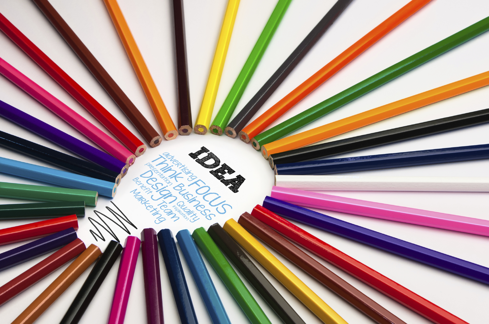
Photographs, illustrations and graphics help make a page more visually appealing. They can catch the eye and break up large blocks of text.
Use pictures whenever you can. They should complement the message being delivered in the text so that both the visuals and text should work together to convey your points.
Your website is an investment in the success of your business. It’s often the first impression people get of your business. And it could be the deciding factor between choosing to work with your organization or your competitors.
Make sure your website’s content and design represent your organization well and reflect the quality and professionalism of your brand.

Wow! Sounds great! I’d call that a wrap. Thank you so much for bearing with me. This was well worth the effort. Really sends the message home – POW!
Corey Hooper
President
Creators Bounty
Lighthouse Point, Florida
Susan Greene
Professional Copywriter
Affordable Rates
Orlando, Florida
floridacopywriter@gmail.com
(407) 578-5528
![]()
![]()