
One-page, landing page microsites are gaining popularity as a simple, cost-effective marketing tool.
One of the hottest trends in online marketing these days is the one-page, landing page website, also sometimes called microsites. As stand-alone pages, these microsites are a departure from the tried-and-true multi-page websites with their Home, About, FAQ and Contact pages. Instead, visitors don’t click through the various pages of a site; they just scroll down through the different sections.
Your main website is the heart and soul of your online presence. “A microsite, on the other hand, is a website with a special purpose,” according to Brand Fabrik. “While your website draws attention to all of your products or services, your microsite might only focus on one very important component of what you do.”
The term microsite is also used interchangeably with “branded blog,” “communication platform,” or “independent campaign,” according to Contently. “They’re all essentially the same thing: a website on which your brand publishes content, and to which your desired readers (hopefully) visit.”
The one-page, landing page website offers some distinct advantages. By eliminating the option of clicking on other pages and choosing their own path, you’re able to control how visitors see your presentation. Top to bottom is their only choice.

Landing pages must be succinct yet comprehensive.
Visitors are also able to get the full picture of your product or service all in one place. You needn’t worry about whether they find the information you feel is most important on your site. Because you’ve boiled down that information to fit on one page, you can be confident it won’t be missed.
Some people see the brevity of one-page landing pages as their downside. Although there’s no physical limit on how much space you have, you risk losing the visitor’s attention if you make the landing page too copy-heavy. Succinctness is a necessity. So keep that mind when writing the copy and mind the adage, less is more.
A dedicated one-page landing page website is ideal for promoting a specific product or application. By narrowing your focus, you’ll be able to stand out in your niche. You’ll look like a specialist or authority in your space. Let’s take a look at an example.
One of my clients creates special packaging materials for shipping metal parts. Their bags and boxes are treated with a chemical that prevents metal from corrosion. The company has two distinct markets. One is electronics manufacturers and the other is the military.
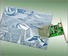 Each of those markets has specialized needs. By creating a separate landing page for each market, the company is able to speak directly to that market’s requirements and emotional triggers. All photos and copy tie in directly to that customer’s needs. And with a dedicated one-page website, the company is positioning itself as uniquely qualified to produce those packaging materials for the specific market segment or demographic.
Another client of mine is a law firm that handles cases against pharmaceutical companies. When they target a specific medication, they create a single-page landing page related to it. No other pharmaceuticals are mentioned, and the page is laser focused on that singular issue.
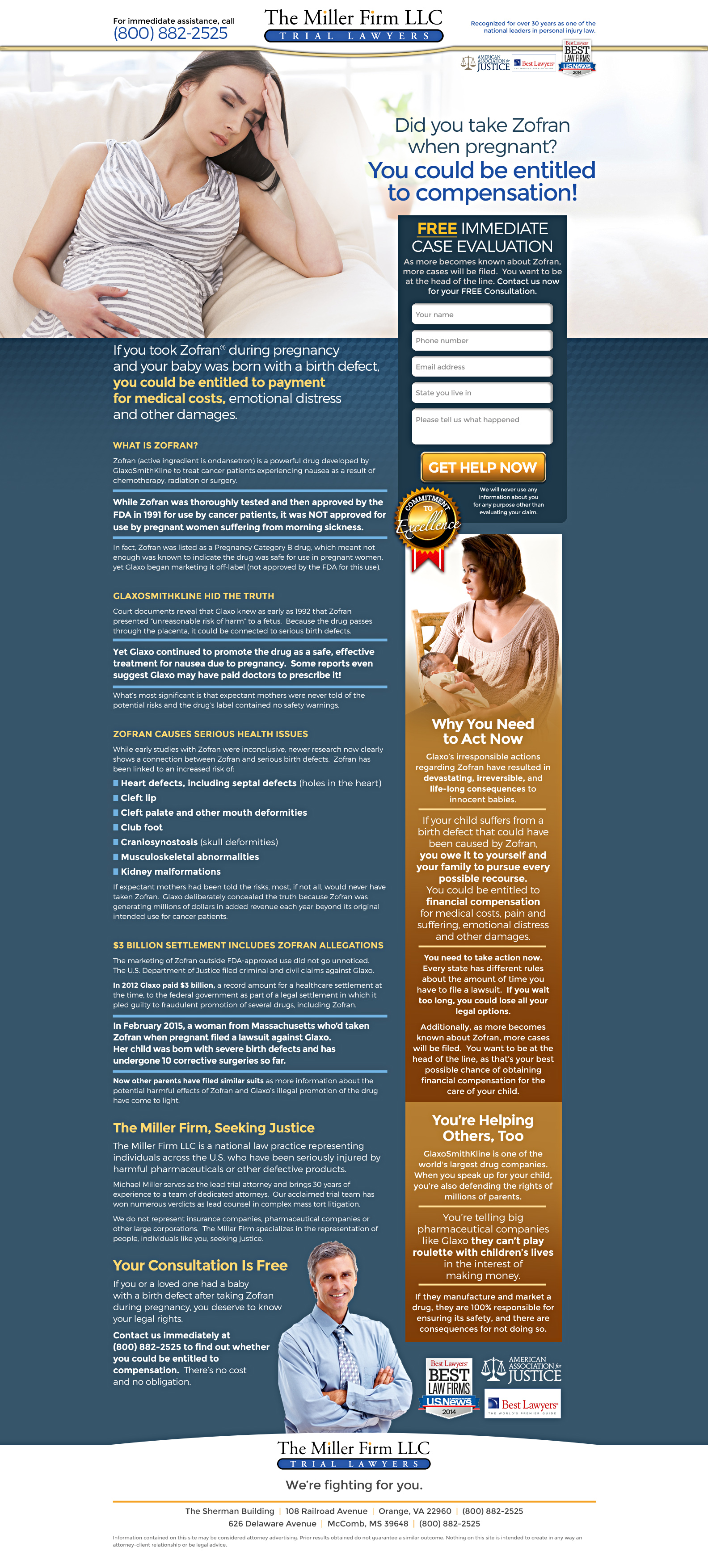
This law firm creates individual landing pages for each of the class-action suits it plans to file.
“Some experts believe that creating a microsite is never a good idea, diluting the brand and hurting coveted search results, while others think they still have a place in a targeted, strategic marketing campaign,” according to Trew Marketing. My experience has been that microsites and landing pages are fabulous tools for supplementing–not replacing–your primary online presentation.
When you’re just beginning your business, you may not have all that much to say. Filling a multi-page website may be a stretch. And your budget may be limited as well. A one-page, landing page website can be the perfect solution.
It gives you an online presence, a URL you can put on your business card. Think of it as a virtual brochure, a quick overview of your business that provides instant credibility to anyone who checks you out. That’s exactly what this startup moving company needed to kickstart its marketing.
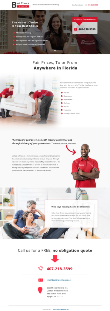
This Florida moving company is a startup business that needed a one-page, landing page to establish its online presence.
A few months down the road, when the cash is flowing and you’ve determined the direction for your business, expand that landing page/online brochure into a more comprehensive website.
A one-page, landing page website must be graphically attractive. No matter how compelling your copy, if the landing page’s design is not eye-catching, you won’t keep the visitor’s attention.
Clean designs work best for landing pages and microsites. That means avoiding clutter and distractions like using multiple fonts or lengthy statements in all caps.
Make your page visually rich, incorporating photos or illustrations and graphics. The font should be easy on the eyes and surrounded by plenty of white space to stand out. Use directional cues such as arrows or red circles around words to direct eyes to what’s most important.

As in real life, a cluttered design in a landing page can overwhelm your visitors.
You’ve probably heard the term compartmentalize related to psychology, but it works in the design of one-page, landing page websites as well. Create different segments within the page. In fact, you can even think of each section as its own individual page with a title, explanation, and call to action. Use color, lines, and other graphic techniques to visually separate the sections.
If all this sounds a bit overwhelming, consider hiring a professional web designer for your one-page, landing page. The price for something so simple will be reasonable. More importantly, it’s an investment that will pay for itself many times over if done right to deliver results.
A one-page, landing page website should start with your core value proposition, a clear statement that explains to your prospective customers how your product solves their problem and improves their situation. It’s the most compelling reason why they should do business with you rather than your competition. And it gets to the heart of why your company exists.
Your value proposition must answer two simple questions: “What is your product or service?” and “Why should they care?”
On a one-page, landing page website, your value proposition can take the following form:
Studies show you have a mere 5 to 30 seconds to hold the attention of a viewer. So invest the time to develop that value proposition and make sure it succinctly explains the benefits you bring to the table. Then place it front and center on your one-page, landing page website
In a one-page, landing page website, you don’t have to worry about your visitor clicking around because there’s nowhere to go. One page is the whole enchilada, so no menu needed. And no top, side or footer navigation.
A one-page, landing page website requires no navigation or menu.
Without a menu, your visitor won’t be distracted from your message. Since all the pertinent information should be contained within the single-page landing page, the need for navigation is eliminated and the importance of clearly stating your benefits is magnified.
Part of the beauty of a landing page is its simplicity. Your one-page landing page should have a single call to action.
Whereas on a traditional website, you might have a Contact page, and various opportunities for the visitor to request more information, call or schedule an appointment, the one-page landing page should have only one objective.
Minimal distractions and few options help prevent your visitors from being sidetracked and instead direct all of their attention to the call to action.
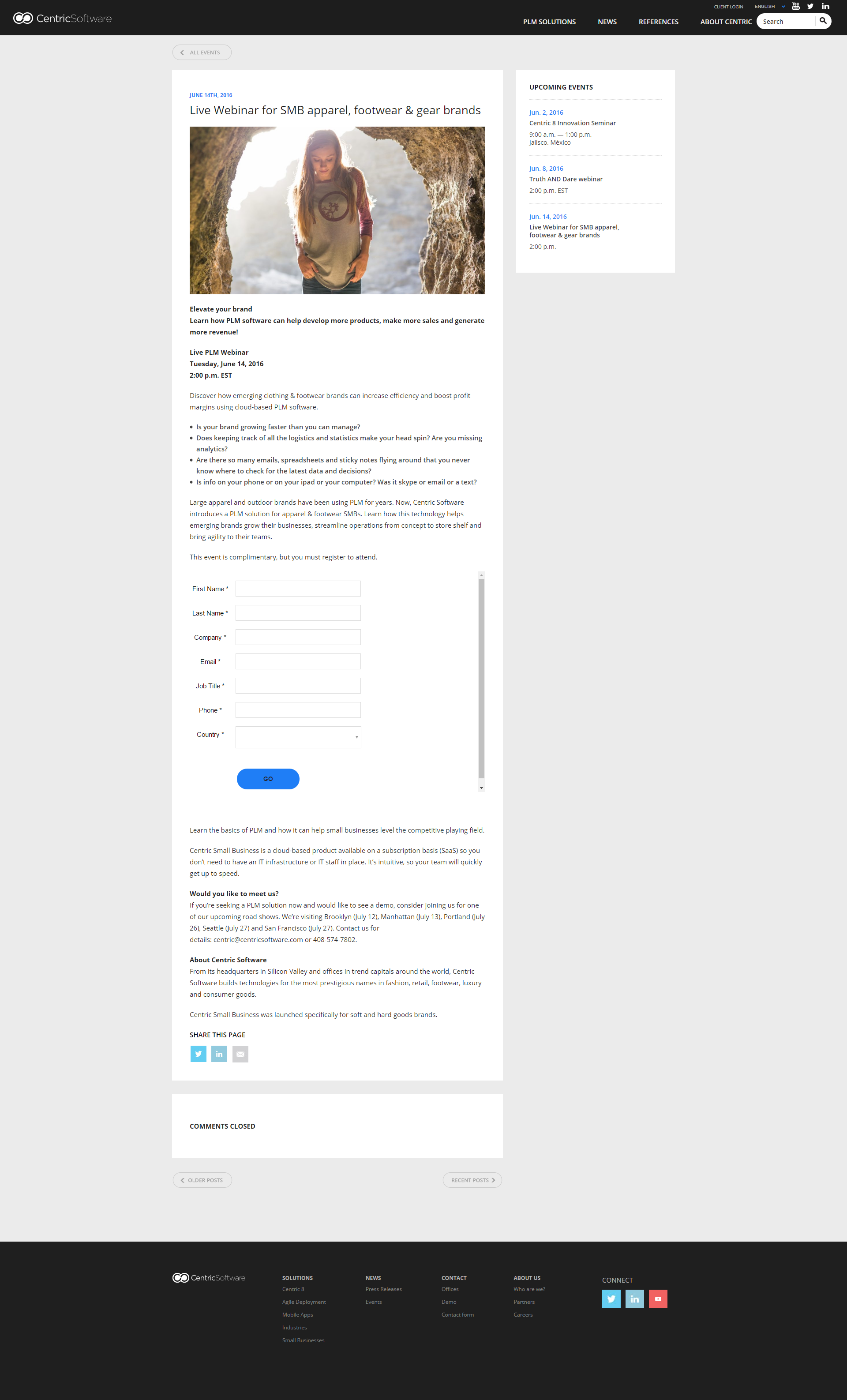
This company, which makes software for the fashion industry, used a one-page, landing page website to promote its upcoming webinar.
Although that objective can be anything you’d like, the most common call-to-action is to offer something of value for free to visitors in exchange for their email address. The freebie can be a report, a consultation, an estimate, a demo or even access to a webinar or video.
While you should limit your landing page to one call-to-action, don’t hesitate to repeat that CTA multiple times. If your page is broken into sections, include a CTA with each section.
Also, don’t forget to reinforce the CTA with the wording on your button, such as “Get Report Now” or “See Demo” as opposed to something nondescript like “Click Here.”
Since you won’t be able to include all the background on your company, be sure to use a tagline. This gets back to your value proposition. Your tagline is a super slimmed down version of it.
Paired with your logo, it should give the visitor a succinct description of who you are or what you do. Bonus points if it’s catchy or memorable like Nike’s “Just do it,” M&Ms’ “Melts in your mouth not in your hand,” and Bounty’s “The quicker picker upper.”
Because you’re providing a limited amount of information, the need for validation is increased. Anything you can use to increase a visitor’s confidence in you is a plus.
Third-party validation from known organizations like Good Housekeeping and the Better Business Bureau can help give your landing page credibility.
The Good Housekeeping Seal of Approval, Verisign, the Better Business Bureau, your local Chamber of Commerce are all examples of well-recognized validation that will help remove doubt from a prospective customer’s mind.
Having a customer say you’re awesome is more credible than saying it about yourself. Customer testimonials should have a place on your one-page, landing page website.
They can be written statements and should include the name of the person speaking. Use first and last names if possible to enhance validity. You might also include the speaker’s city and state to help attract other customers from the same area who feel they can relate to what’s being said.
If your customers can provide a photo to accompany their statement, that further adds credibility. And the jackpot is a video testimonial in which your visitor can hear and see your customer talking about how amazing you are.
Down the road, as your company acquires more success stories, you can use these testimonials to build long-form case studies, adding another tool to your marketing arsenal.
I mentioned the use of video for testimonials, but that’s not the only purpose it can serve. Consider including a brief video welcome message from the company CEO or manager.
Being able to look that CEO in the eye and hear her voice adds a strong element of believability and can help advance the prospect to customer.
One of the best techniques for increasing conversions is to introduce urgency to your copy.

Give your visitors an added push to take action now by adding a deadline or limit to your offer.
A limited time offer, limited quantity or limited availability can all hasten a prospect to take action.
Vary the way you present information within your one-page landing page website to keep the visitor’s attention. Bulleted or numbered lists are eye-catching and allow the reader to scan the copy quickly.
A list of services is a shorthand opportunity to spell out all that you offer. Not only will you be more likely to get requests for those specific services; you’ll also be less likely to be contacted by time-burner prospects who are not a fit for you.
A features list is an opportunity to tout your product’s or service’s best attributes. It allows prospects to mentally check off how your product is a fit for them.
Finally, a list of benefits can present a compelling summary of all the wonderful things that prospects can expect if they make a purchase from your company. How can they possibly say no?
Rapidly gaining acceptance is live chat, which provides an opportunity for visitors to get their questions answered immediately and, conversely, for the company to interact with a prospect early on in the sales process.

Live chat on a landing page can be effective in engaging prospects.
Because a large percentage of your audience is likely to view your one-page, landing page website on their smart phone or tablet, you must design with these smaller media in mind.
Your landing page must look good and function on a PC monitor, tablet and smartphone.
Your page should be automatically responsive so it looks and functions well no matter how the page is viewed.
If you’re looking for a way to launch your new business or promote one specific product or service from your existing business, consider a one-page, landing page website.
Track your results to see how it’s working for you and continually refine your presentation as you define the direction of your business.

As with any marketing tool, you’ll want to track results and make adjustments as needed.
In today’s multi-media world, you have no shortage of options when it comes to how to market your business. Single-page, landing page, microsites are a cost-effective and relatively easy way to test the waters and help your business gain traction.
Susan Greene is a landing page copywriter based in Orlando, Florida. She works with businesses all over the world to create compelling, online presentations that generate leads and sales.
Copy approval of the skincare article went very smoothly, and we don't need to make any further changes. Thank you for your excellent work!
Nozomi Araki
International Corporate Communications
Brain Center Inc.
Tokyo, Japan
Susan Greene
Professional Copywriter
Affordable Rates
Orlando, Florida
floridacopywriter@gmail.com
407-342-2070
![]()
![]()